Visual Language Week 10
 November 20, 2009
Filed under Visual Language
Tags: Balance, Contrast, Design Principles, Emphasis, Movement, Semiotics, Visual Language
Hey Hey Hey!
So we’re finished week 10. Christmas is just around the corner, as is semester two! Time fly’s!
We started the lecture by going through the assessment process of the module, which assignments had what weighting. We also talked about our current assignment, which is on Semiotics. We moved on to review the notes from the previous weeks Semiotics lecture.
This weeks lecture was on Design Principles.
Design does not equal creativity. Creativity could be inherited and depends on the thought process that is nurtured. The principles of design can be thought of as ‘what we do to the elements of design’.
1. Balance
Balance refers to the degree of equilibrium in a composition. This is determined by the choice and arrangements of elements in relation to each other and the frame.
Symmetrical balance is a mirror image balance. 
Asymmetrical balance has elements that don’t mirror each other across a center line.
Lack of balance can convey action and motion. Off-balance designs can get people thinking.
2. Contrast
Contrast can simply mean difference.
Composition, size, shape and colour are four main ways to achieve contrast in a composition. This creates interest and pulls the attention towards the focal point.
Composition creates tension by placing opposing elements in a relation to one another.
Size is useful as it can make for a way into a visual arrangement.
Shape can add tension to a composition.
Colour can be used to balance areas of neutral colours.
3. Movement
The purpose of movement is to create unity in the artwork.
Repetition occurs when elements which have something in common are repeated regularly or irregularly creating a visual rhythm.
Line is used to create a feeling or sense of movement.
Rhythm refers to the way your eyes move around the picture.
4. Emphasis
Emphasis is the stressing of a particular area of focus rather than the presentation. Simplicity is omitting all non-essential or unimportant elements of details that do not contribute to the overall composition.
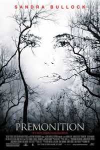
We then had to get into a group of four and analize a movie poster. We had to talk about the Balance, Contrast, Movement and Emphasis of the image. We got the extremely famous Sandra Bullock movie ‘Premonition’.
- Balance = The face is centrally located in the image (Symmetrical).
- Contrast = Dark and Light colours are used, also the text is in red to draw the attention to the ‘star’.
- Movement = The branches making the shape of the face.
- Emphasis = would be on the actors name, because of the colour, and the eyes and lips.
Next we had our lab!
In the lab, we were told how to backdate our blog entries!
Niamh gave us a handout with Louis Walsh in it for us to have a go at editing in Photoshop.
I knew how to do this so I continued on with my Semiotics assignment. I had all of my images completed, so all that I needed to do was to to write a short paragraph on each image explaining my approach and creative decisions and the process involved. When I had this completed, I created the folder for submission. Here is one of the starting ideas that I came up with:
‘Till the next time!


